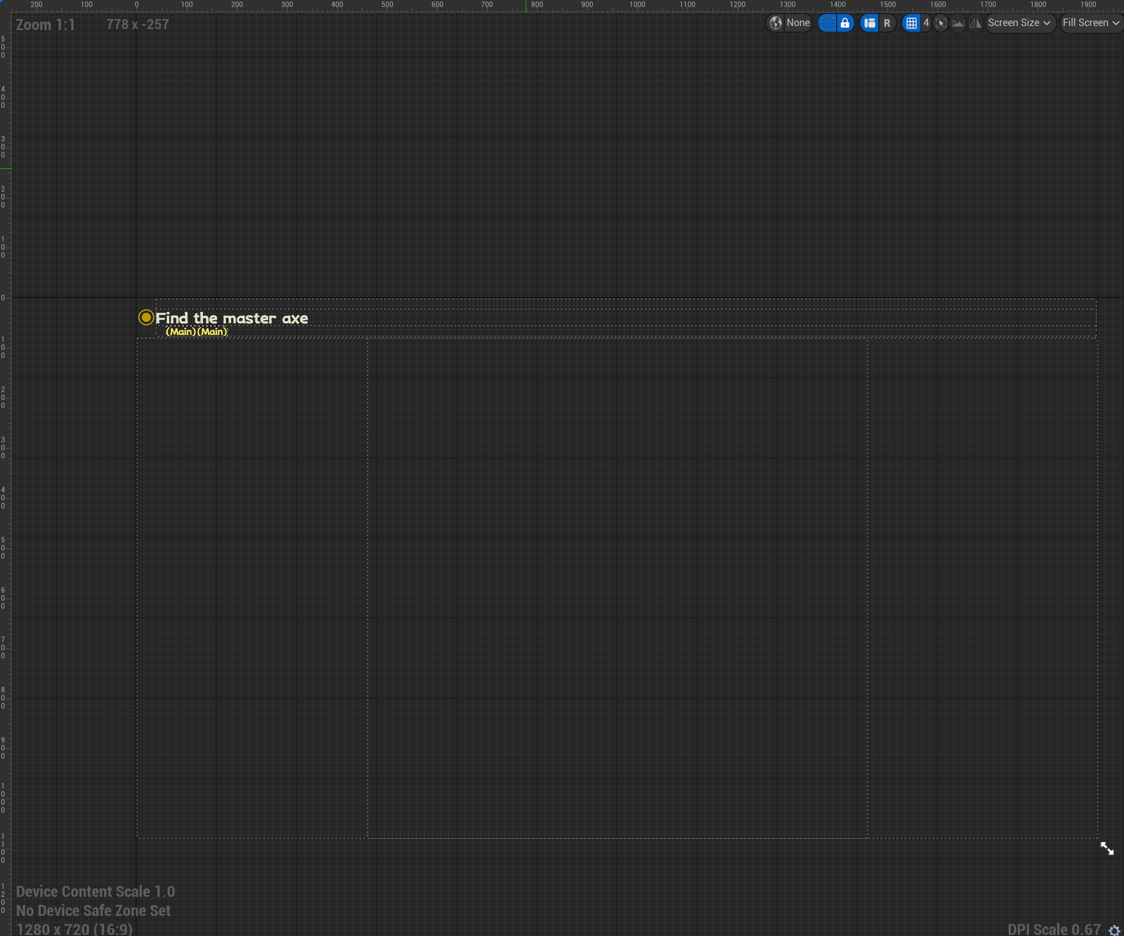
Master UI
Widget Tutorial System Documentation
Master UI introduces a user-friendly widget system, empowering you to effortlessly create customized widgets for your game. The simplicity of the widget system is evident as you explore the demo, where it has already been seamlessly integrated. Within this document, we will provide an overview of all available widgets and detail the methods at your disposal for crafting your own personalized widget.
Variables
| Name | Type | Description |
|---|
| Left click mouse can interact | Boolean | Used for the gamepad |
| Clear Virtual Controller AfterAction | Boolean | Used for the gamepad |
| Dark Version | Boolean | Dark version of the button |
Methods
| Name | Description |
|---|
| API_SetValue | Set the text of the button |
Event Callbacks
| Event Name | Description |
|---|
| OnButtonClicked | Called when the button is clicked |
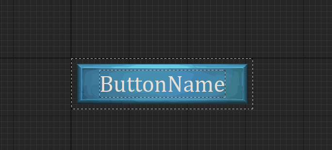
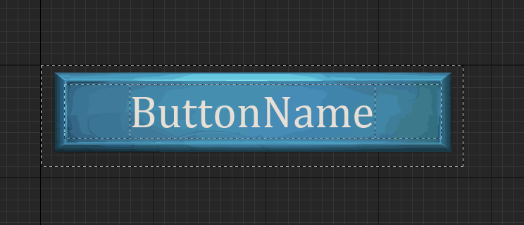
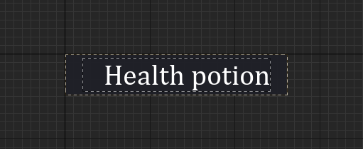
WBP_Master_ButtonText
Variables
| Name | Type | Description |
|---|
| ButtonText | Text | Text of the button |
| Left click mouse can interact | Boolean | Used for the gamepad |
| Clear Virtual Controller AfterAction | Boolean | Used for the gamepad |
| UseAnimation | Boolean | Use animation when the button is hover |
Methods
| Name | Description |
|---|
| API_SetValue | Set the text of the button |
Event Callbacks
| Event Name | Description |
|---|
| OnButtonClicked | Called when the button is clicked |
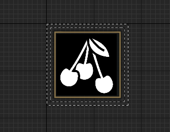
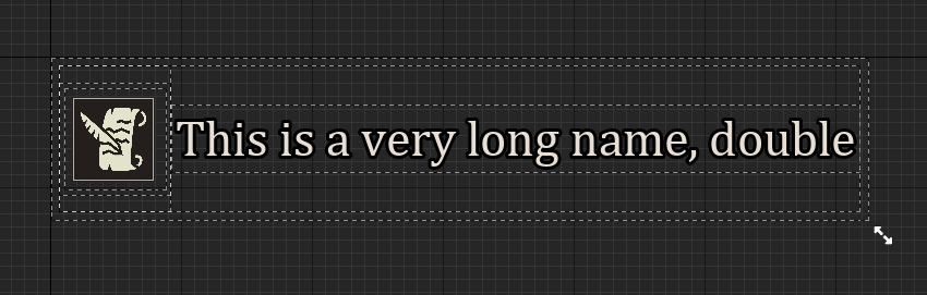
WBP_Master_ButtonTextWithIcon
Variables
| Name | Type | Description |
|---|
| ButtonText | Text | Text of the button |
| ButtonIcon | Texture2D | Icon of the button |
| ButtonColor | Liner Color | Color of the button |
| Left click mouse can interact | Boolean | Used for the gamepad |
| Clear Virtual Controller AfterAction | Boolean | Used for the gamepad |
| UseHoverAnimation | Boolean | Use animation when the button is hover |
Methods
| Name | Description |
|---|
| API_SetValue | Set the text of the button |
Event Callbacks
| Event Name | Description |
|---|
| OnButtonClicked | Called when the button is clicked |
Icons
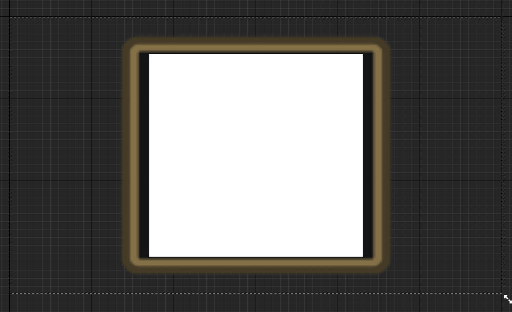
WBP_Master_IconBoxDisplay
Variables
| Name | Type | Description |
|---|
| IconVaraible | Texture2D | Icon of the button |
| HideIconBorder | Boolean | Hide the border of the icon |
Methods
| Name | Description |
|---|
| API_SetValue | Set the icon of the button |
WBP_ExpandableArea
You can use this widget to create a expandable area, you can use this widget to create a settings menu for example.
Methods
| Name | Description |
|---|
| API_PlayAniamtion | Start the flashing animation |
| API_StopAnimation | Stop the flashing animation |
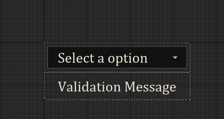
WBP_Master_InputText
Variables
| Name | Type | Description |
|---|
| DisableValidationMessage | Boolean | Disable the validation message |
Methods
| Name | Description |
|---|
| API_DIsplayValidationError | Display the validation error |
Event Callbacks
| Event Name | Description |
|---|
| OnTextChange | Called when the text change |
WBP_Master_ComboBox
Variables
| Name | Type | Description |
|---|
| DisableValidationMessage | Boolean | Disable the validation message |
Methods
| Name | Description |
|---|
| API_DIsplayValidationError | Display the validation error |
Event Callbacks
| Event Name | Description |
|---|
| OnSelectionChange | Called when the selection change |
List
WBP_Master_ComplexList
Variables
| Name | Type | Description |
|---|
| OnMouseHover | Boolean | Called when the mouse is hover |
Methods
| Name | Description |
|---|
| API_SetSlot01 | Set the slot 01 |
| API_SetSlot02 | Set the slot 02 |
Event Callbacks
| Event Name | Description |
|---|
| OnButtonClicked | Called when the button is clicked |
WBP_Master_SimpleList
Variables
| Name | Type | Description |
|---|
| MouseHover | Boolean | Called when the mouse is hover |
Methods
| Name | Description |
|---|
| API_SetSlot01 | Set the slot 01 |
Event Callbacks
| Event Name | Description |
|---|
| OnButtonClicked | Called when the button is clicked |
Notifications
WBP_LogMessage
Variables
| Name | Type | Description |
|---|
| Message | Text | Message of the notification |
| TextColor | Color | Color of the text |
| DestoryTime | Float | Time before the notification is destroyed |
| OverhideIcon | Texture2D | Icon of the notification |
ProgressBar
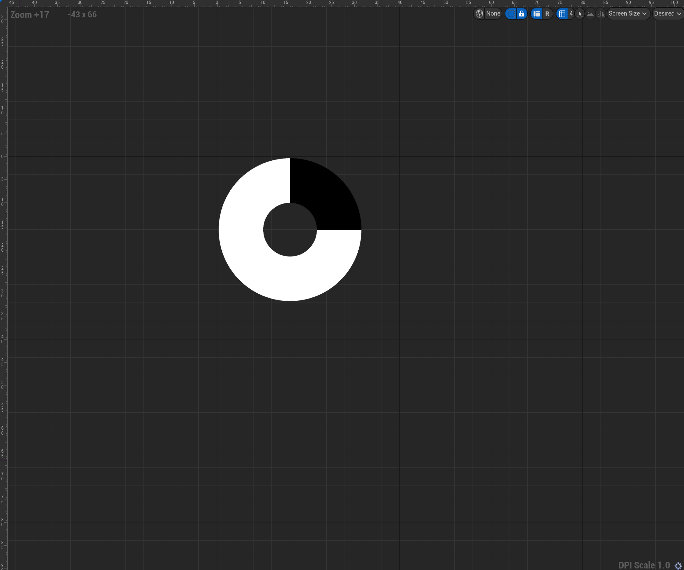
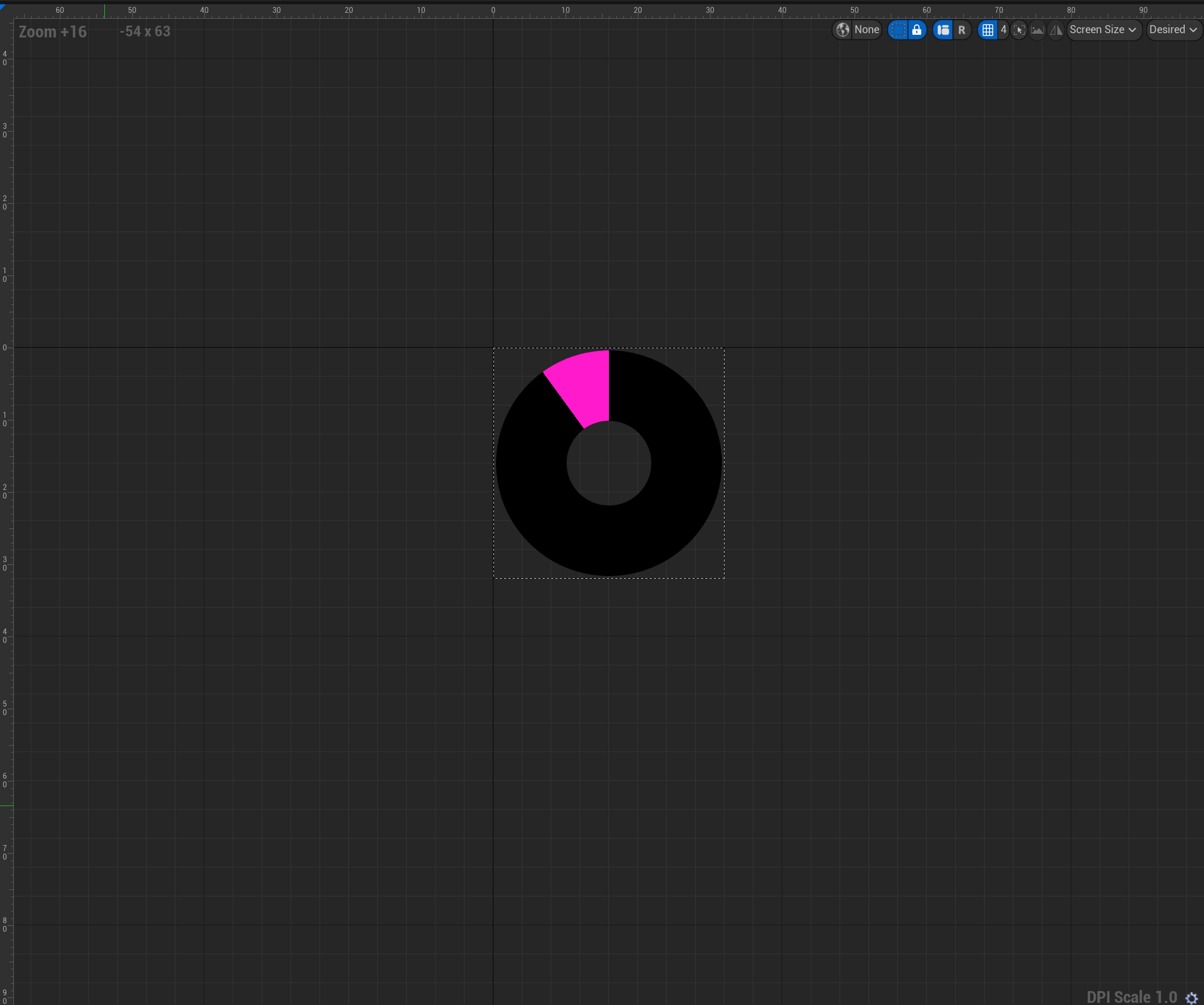
WBP_Master_Circular
Variables
| Name | Type | Description |
|---|
| BarColor | Color | Color of the bar |
Methods
| Name | Description |
|---|
| API_SetPercentage | Set the percentage of the bar |
| API_ChangeBarColor | Change the color of the bar |
Event Callbacks
| Event Name | Description |
|---|
| ProgressFinish | Called when the progress finish |
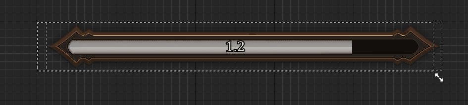
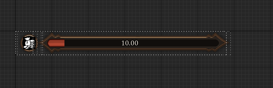
WBP_Master_ProgressBar
Variables
| Name | Type | Description |
|---|
| CooldownTimer | Float | Time before the cooldown is finish |
| ProgressBarImg | Texture2D | Image of the progress bar |
| ToogleBarTextDisplay | Boolean | Display the text of the progress bar |
| UseTimer | Boolean | Use the timer |
| BarColor | Color | Color of the bar |
Methods
| Name | Description |
|---|
| StartTimer | Start the timer |
| ProgressEnd | Called when the progress finish |
| API_toogleBarTextDisplay | Toogle the text display |
| API_toogleTimerUsage | Toogle the timer usage |
| API_ChangeBarColor | Change the color of the bar |
Event Callbacks
| Event Name | Description |
|---|
| ProgressFinish | Called when the progress finish |
Slots
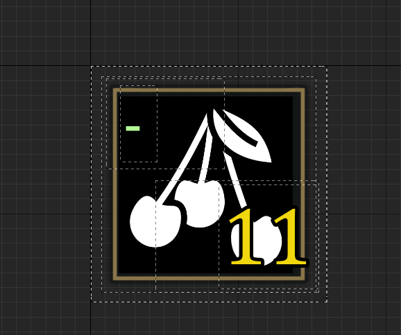
WBP_BaseItemSlot
Variables
| Name | Type | Description |
|---|
| ShowQty | If true the quantity box will be shown | |
| ShowIndex | If true the index box will be shown | |
| ShowSelected | If true the slot selected will be shown | |
| ShowIcon | If true the icon will be shown | |
| UseDefaultIconOnStart | If true the default icon will be used on start | |
| ShowIconBorder | If true the icon border will be shown | |
| UseIconOverlay | If true the icon overlay will be shown | |
Methods
| Name | Description |
|---|
| API_ToogleQtyBox | Toogle the quantity box |
| API_ToogleIndexBox | Toogle the index box |
| API_ToogleSlotSelected | Toogle the slot selected |
| API_ToogleIcon | Toogle the icon |
| API_ToogleIconBorder | Toogle the icon border |
| API_ToogleIconOverlay | Toogle the icon overlay |
| API_ChangeQtyValue | Change the quantity value |
| API_ChangeIndexValue | Change the index value |
| API_ChangeIcon | Change the icon |
| API_ChangeBorder | Change the border |
| API_ChangeOverloadIcon | Change the overload icon |
| API_StartCooldown | Start the cooldown |
| API_ClearCooldown | Clear the cooldown |
Event Callbacks
| Event Name | Description |
|---|
| CooldownStart | Called when the cooldown start |
| CooldownFinish | Called when the cooldown finish |
Spinner
WBP_Spinner
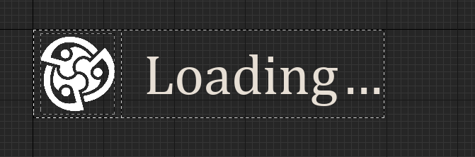
Methods
| Name | Description |
|---|
| API_SetValue | Set the value of the spinner |
Stats
WBP_DefaulPlayerStats
Variables
| Name | Type | Description |
|---|
| MaxStats | Float | Max stats of the bar |
| TargetStatsValue | Float | Target stats value of the bar |
| CurrentValue | Float | Current value of the bar |
| WIthOverhide | Float | With overhide of the bar |
| HeightOverhide | Float | Height overhide of the bar |
| OverhideSize | Boolean | Overhide size of the bar |
Methods
| Name | Description |
|---|
| API_UpdateStats | Update the stats of the bar |
| SnapBarValue | Still will be use internally to update and set the bar value |
| StartSmoothBar | This method will be use internally to start the smooth bar animation |
| StopSmoothBar | This method will be use internally to stop the smooth bar animation |
Event Callbacks
| Event Name | Description |
|---|
| ProgressFinish | Called when the progress finish |
WBP_DefaulPlayerStatsCircular
Variables
| Name | Type | Description |
|---|
| MaxStats | Float | Max stats of the bar |
| TargetStatsValue | Float | Target stats value of the bar |
| CurrentValue | Float | Current value of the bar |
| WIthOverhide | Float | With overhide of the bar |
| HeightOverhide | Float | Height overhide of the bar |
| OverhideSize | Boolean | Overhide size of the bar |
Methods
| Name | Description |
|---|
| API_UpdateStats | Update the stats of the bar |
| SnapBarValue | Still will be use internally to update and set the bar value |
| StartSmoothBar | This method will be use internally to start the smooth bar animation |
| StopSmoothBar | This method will be use internally to stop the smooth bar animation |
Event Callbacks
| Event Name | Description |
|---|
| ProgressFinish | Called when the progress finish |
Title
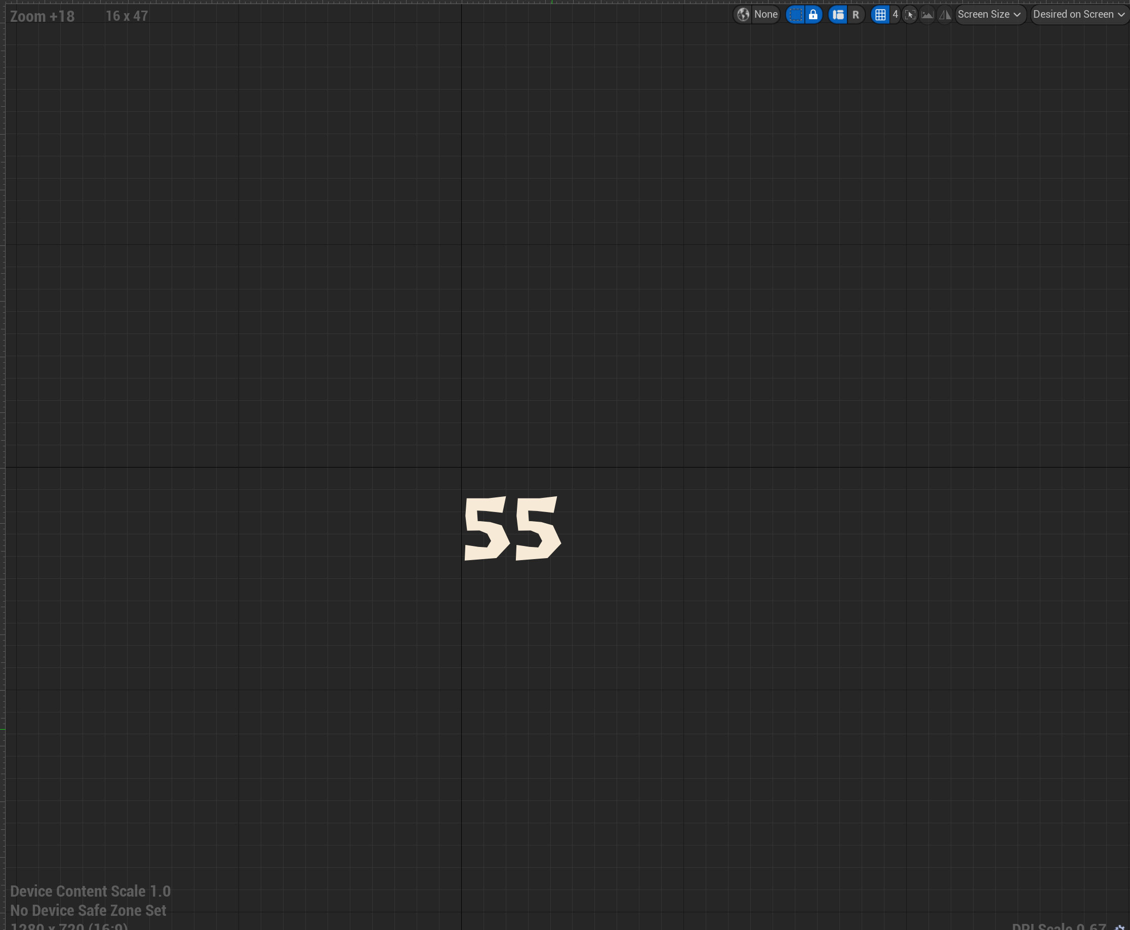
WBP_AnimatedNumberText
Variables
| Name | Type | Description |
|---|
| Color | Color | Color of the text |
| StartBarSmooth | Boolean | Start the bar smooth |
Methods
| Name | Description |
|---|
| API_ChangeValue | Change the value of the text |
Event Callbacks
| Event Name | Description |
|---|
| ProgressFinish | Called when the progress finish |
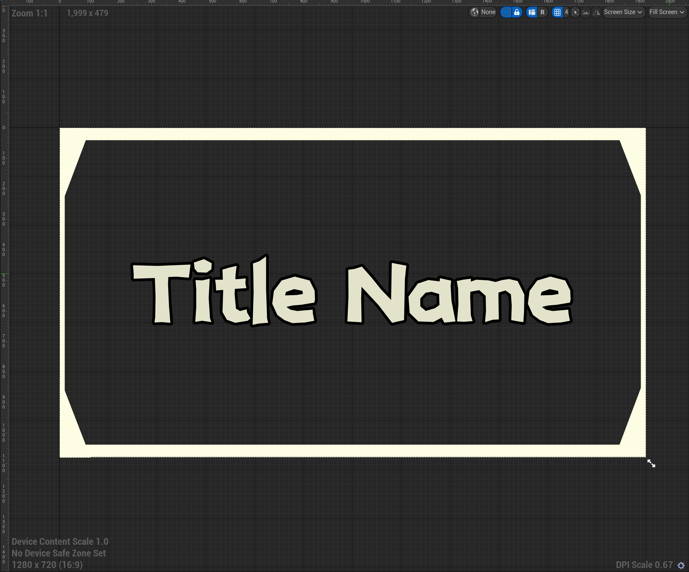
WBP_Master_Title
Variables
| Name | Type | Description |
|---|
| TitleText | Text | Text of the title |
| TitleColor | Color | Color of the title |
| UseTitleBorder | Float | Size of the title |
Methods
| Name | Description |
|---|
| API_SetValue | Set the value of the title |
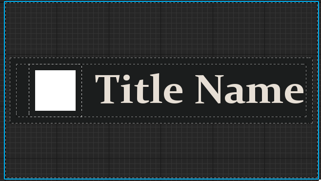
WBP_Master_TitleWithIcon
Variables
| Name | Type | Description |
|---|
| TitleText | Text | Text of the title |
| TitleColor | Color | Color of the title |
| UseTitleBorder | Float | Size of the title |
Methods
| Name | Description |
|---|
| API_SetValue | Set the value of the title |